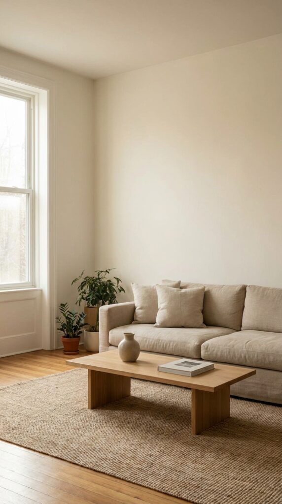

The first apartment I ever furnished had a living room that measured barely eleven feet by twelve, and I made almost every mistake it was possible to make in that space before I understood why it wasn’t working. I bought a sofa sized for a much larger room because it looked comfortable in the showroom. I pushed every piece of furniture against the walls, which is the advice you hear most often, and the room still felt cramped and oddly unusable in the middle. It took embarrassingly long to realize that a small living room isn’t just a smaller version of a big one. It plays by different rules entirely, and most of those rules have almost nothing to do with how much furniture you own.
What actually changed things wasn’t buying less. It was understanding scale, sightlines, and the specific kind of furniture that earns its footprint twice over in a room where every square foot is doing real work. A sofa that’s two inches too deep, a coffee table that blocks the natural walking path, a rug that’s sized wrong for the seating area, these are the kinds of details that quietly make a small room feel smaller than its actual dimensions, and fixing them costs far less than people assume.
This isn’t a list of clever tricks or optical illusions. It’s the practical, sometimes unglamorous decisions, the actual measurements, the furniture proportions, the layout logic, that determine whether a small living room feels genuinely functional or like a slightly too-full storage unit with a television in it. Fifteen of them, each one worth more explanation than a single quick tip usually gets.
1. Measure the Actual Walking Path Before Choosing Any Furniture
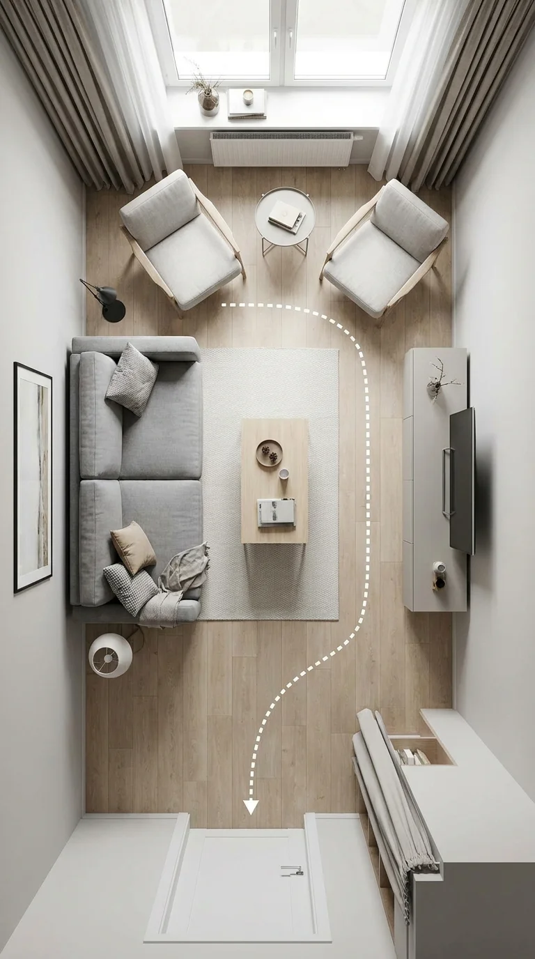
Before deciding on a single piece of furniture, walk the room and identify the paths people actually need to use, from the doorway to the seating area, from the seating area to any other exit, around the coffee table to reach a shelf or window. A walking path needs a genuine 30 to 36 inches of clearance to feel comfortable rather than cramped, and in a small living room, this measurement should come before any furniture shopping, not after.
Most people furnish a room by placing pieces where they look good and then discovering the walking path afterward, often finding it’s been reduced to a narrow, awkward squeeze between a sofa arm and a side table. Working in the opposite order, mapping the required paths first and then fitting furniture into what remains, produces a room that feels more spacious even when it contains exactly the same amount of furniture as the version furnished the other way around. This is worth doing with actual painter’s tape on the floor if the room is tight enough that a few inches genuinely matter, which in most small living rooms, they do. Taping out a rough furniture layout before anything is delivered catches sizing problems while they’re still just an afternoon’s inconvenience rather than a return shipping headache.
2. Choose a Sofa Depth of 32 Inches or Less
Standard sofa depth runs anywhere from 32 to 40 inches, and that range makes a much bigger difference in a small room than the difference in inches suggests. A 38-inch deep sofa in an eleven-foot-wide room can eat up nearly a third of the room’s total depth on its own, which is exactly the mistake I made in that first apartment. A sofa in the 30 to 32 inch range gives up very little in actual seating comfort while returning several genuinely useful inches to the rest of the room.
Depth matters more than width here in most cases, since a slightly narrower sofa is a more obvious compromise than a slightly shallower one, and most people notice the loss of width immediately while barely registering a couple of inches of depth. If the room allows for it, prioritizing keeping the full width of a three-seat sofa and trimming depth instead of the reverse tends to produce a better-feeling result.
Track down the actual depth measurement before purchasing, since showroom photos and even product listings sometimes make this harder to find than the overall dimensions, which are usually prominently listed while depth is buried in a spec sheet. A few extra minutes of research here prevents a genuinely disruptive mistake.

3. Use a Rug That’s Actually Sized for the Seating Area
A rug that’s too small for its seating area is one of the most common and most visually damaging mistakes in a small living room, since it makes the whole arrangement look like it’s floating in the middle of the floor rather than anchored as a cohesive zone. The general rule is that at minimum, the front legs of every seating piece should sit on the rug, and ideally all four legs of the sofa and chairs do.
In a small room, this often means the rug needs to be larger than intuition suggests, since the instinct in a tight space is often to size down everything, including the rug, which actually works against the room rather than for it. A rug that properly anchors the seating area, even if it means the rug extends nearly to the walls on one or two sides, does more to make a small room feel intentionally furnished than almost any other single choice on this list.
Cost is a real factor here, since a properly sized rug for even a modestly small living room often needs to be at least 6×9 or 8×10 feet, and a decent wool or wool-blend option in that range runs $250 to $600. A flat-weave or lower pile option in a similar size costs less, generally $100 to $300, and works just as well for this specific anchoring purpose if budget is the deciding factor.

4. Choose Furniture With Exposed Legs Over Skirted Bases
Furniture with visible legs, whether wood, metal, or a combination, lets the eye see the floor continuing underneath it, which creates a sense of openness that skirted or fully upholstered-to-the-floor furniture simply doesn’t allow. This single detail has an outsized effect on how spacious a small living room feels, since floor visibility reads as available space even when the actual square footage hasn’t changed at all.
This applies to nearly every piece in the room, the sofa, any accent chairs, even a media console or bookshelf if the design allows for it. A room where every major piece sits directly on the floor with no visible gap underneath reads as considerably more crowded than the same room with the same furniture raised on legs, even when measured square footage occupied is nearly identical between the two scenarios.
Lighter-colored or natural wood legs tend to disappear more visually than dark or black ones, which can read as more of a defined shape against a light floor. This is a minor detail relative to the legs-versus-skirt decision itself, but worth considering if the room’s flooring is on the lighter end of the spectrum.

5. Hang Curtains Higher and Wider Than the Window Frame
Mounting curtain rods 4 to 6 inches above the actual window frame, and extending them several inches past each side of the frame, makes the window itself read as taller and wider than its actual dimensions, which has a meaningful effect on how expansive the whole wall feels. This is a genuinely low-cost change, usually just requiring a slightly longer curtain rod than the window’s exact width, and it’s one of the more dramatic proportion changes available for the amount of effort involved.
The curtains themselves should be long enough to just clear the floor, or puddle very slightly, rather than stopping short several inches above it. Curtains that end mid-window or well above the floor create a visual break that makes the ceiling feel lower and the room feel more boxed in, which works directly against the goal in an already small space.
This technique works even in rooms where the actual ceiling height doesn’t allow for dramatically higher rod placement. Even 4 inches makes a real difference, and it’s worth doing regardless of whether the full 6 inches is achievable given a particular room’s proportions.

6. Choose One Large Piece of Art Instead of Several Small Ones
A cluster of small framed pieces introduces visual complexity that a small room often can’t afford, since the eye has to work harder to process several separate objects rather than one cohesive one. A single large-scale piece, even an inexpensive framed print at a substantial size, tends to make a small wall feel more generous rather than more crowded, which runs counter to what most people assume when furnishing a tight space.
The logic here mirrors the furniture-scale advice throughout this list. Filling a small room with many small things, whether furniture or decor, tends to create visual clutter that makes the space feel busier and smaller, while committing to fewer, larger, more considered choices creates a calmer effect that reads as more spacious even though the actual footprint occupied hasn’t necessarily decreased.
Large-format prints are more affordable than people often assume, with plenty of options in the $40 to $120 range for a substantial 24×36 inch or larger piece, well within reach even on a tight decorating budget.

7. Pick Multi-Functional Furniture Over Single-Purpose Pieces
A coffee table with a lift top that converts to a dining or work surface, an ottoman with hidden interior storage, a console table that also serves as a slim desk, all of these let one piece of furniture do the job that would otherwise require two separate items competing for the same limited floor space. In a small living room, this isn’t a nice-to-have detail, it’s often the difference between a room that functions for actual daily life and one that constantly feels like it’s missing something.
The best candidates for this treatment are pieces used intermittently rather than constantly, since a dedicated desk that’s needed for hours every day is a worse candidate for multi-functional replacement than an occasional work surface needed for an hour here and there. Matching the multi-functional piece to genuine usage patterns, rather than buying one simply because the concept sounds appealing, produces better results.
Price tends to run somewhat higher for well-made multi-functional furniture compared to single-purpose equivalents, often 20 to 40 percent more, but the math usually still favors the multi-functional piece once the cost of the second single-purpose item it’s replacing gets factored in.

8. Choose a Media Console That’s Narrower Than the Wall It Sits On
A media console that spans the full width of its wall, or close to it, tends to visually anchor that entire wall as a single dense mass, which reads as heavier and more space-consuming than the same console at a slightly narrower width with visible wall space on either side. Leaving even 8 to 12 inches of breathing room on each side of a media console lets the wall itself remain part of the visual composition rather than being fully absorbed by furniture.
This is a genuinely counterintuitive piece of advice for a small room, since the instinct is often to maximize storage by choosing the largest console that will physically fit. But storage capacity and visual spaciousness are working against each other here, and in a lot of small living rooms, the better trade is a slightly smaller console with genuinely open wall space around it rather than the largest possible unit crammed wall to wall.

9. Use Wall-Mounted or Floating Shelving Instead of Freestanding Bookcases
A freestanding bookcase, even a relatively slim one, occupies floor space and casts a visible footprint that a wall-mounted equivalent simply doesn’t. Floating shelves, even just two or three at varying heights, provide real storage and display space while leaving the floor beneath them completely open, which matters enormously in a room where floor space is the primary constraint.
This works particularly well flanking a media console or fireplace, areas that often call for storage but where a full bookcase would create a heavy, boxed-in feeling. A few well-placed floating shelves accomplish much of the same storage goal while keeping the wall feeling considerably more open below them.
Weight capacity is worth checking carefully here, since floating shelves rated for lighter loads can sag or fail under a genuinely full load of books, and the failure mode for an overloaded floating shelf is considerably more disruptive than an overloaded freestanding one. A properly rated bracket system costs relatively little extra and prevents this entirely.

10. Choose Nesting or Stackable Side Tables Instead of One Large Table
A set of two or three nesting tables provides the same functional surface area as a single larger side table while allowing the footprint to shrink instantly when the extra surface isn’t needed, tucking smaller tables beneath or beside the largest one. This kind of flexibility is disproportionately valuable in a small living room, where the ideal furniture footprint often changes depending on whether the room is hosting a few extra people or being used quietly on an ordinary evening.
This same logic extends to occasional seating. A pair of lightweight stools that can tuck under a console table or against a wall when not needed provides flexible extra seating for the occasional gathering without permanently occupying floor space the rest of the time.

11. Angle Furniture Away From Square, When the Room Allows
A living room arranged entirely in strict right angles, furniture parallel and perpendicular to every wall, can feel more rigid and boxed in than the same furniture arranged with one or two pieces set at a slight angle. This isn’t universally applicable, and it depends heavily on the specific room’s proportions, but in a lot of small, boxy rooms, breaking the strict grid with even a single angled chair softens the geometry in a way that reads as more considered and less cramped.
This is worth experimenting with rather than committing to outright, since an angled arrangement that doesn’t quite work is easy to identify by simply living with it for a few days and noting whether it feels intentional or just awkward. Not every small room benefits from this treatment, but it’s a low-cost experiment worth trying before assuming a strictly square layout is the only option.

12. Choose Sheer or Light Fabric Curtains Over Heavy Drapery
Heavy, lined drapery in a dark or richly textured fabric can read as luxurious in a larger room but tends to visually weigh down a small one, particularly if the room doesn’t get abundant natural light to begin with. Sheer or lightweight linen curtains let more light pass through even when closed, and their lighter visual weight keeps the window wall from feeling like the heaviest, most closed-off element in the room.
This doesn’t mean privacy has to be sacrificed. A layered approach, a simple roller shade for actual privacy paired with sheer curtains for softness and light diffusion, provides both function and the lighter visual effect this idea is describing, without requiring a single heavy curtain to do both jobs at once.

13. Keep Throw Pillows to Two Per Seating Piece, Maximum
A sofa piled with five or six throw pillows might photograph well in a styled shot, but in daily use, those pillows almost always end up on the floor or stacked in a corner, and the sofa’s actual usable seating area shrinks considerably in the meantime. Two pillows per seat cushion, or even just two total on a smaller sofa, provides visual softness without sacrificing the functional seating space that matters more in a small room where every seat genuinely gets used.
This is one of the easier changes on this list to implement immediately, since it usually just means editing down what’s already there rather than purchasing anything new, and the difference in how usable the sofa feels afterward is often more noticeable than people expect going in.

14. Paint the Trim the Same Color as the Walls
Contrasting white trim against a colored wall creates a visual outline that draws attention to the boundary of the room, subtly reinforcing exactly where the walls end, which is the opposite of what helps a small room feel more expansive. Painting the trim the same color, or a very close shade, as the walls themselves softens that boundary and lets the eye read the wall as a single continuous surface rather than a bordered rectangle.
This is a more dramatic, less reversible change than most of what’s on this list, since it typically means repainting trim that’s likely been white for a long time, and it’s worth sitting with the idea for a bit before committing, since it’s a genuinely different look than most people are used to living with. But in a small room specifically, the effect on perceived spaciousness is real and well documented among people who’ve tried it.

15. Resist Filling Every Wall and Surface
The instinct in a small room is often to maximize every inch, filling walls with art and shelves with objects until nothing feels unused. This instinct usually works against the goal. A small room with a few genuinely empty stretches of wall and a couple of surfaces left intentionally clear reads as more spacious and more calmly considered than the same room with every available inch put to use.
This is the hardest idea on this list to actually follow, since it requires resisting the urge to solve every storage or display need within the room itself, sometimes deferring some things to another room or simply owning less. But it’s also one of the highest-impact ideas here, since a room that feels genuinely calm and uncluttered will almost always feel bigger than its measured square footage suggests, regardless of how cleverly every other piece of furniture has been chosen. A small living room done well doesn’t disguise its size. It works with it, choosing furniture at the right scale, keeping sightlines open, and resisting the urge to fill every available inch just because the inch exists. That’s a genuinely different approach than trying to trick the eye, and it tends to produce a room that feels good to actually live in, not just good to photograph once everything’s freshly arranged.