For years, the walls in my living room were an afterthought. I’d get the furniture arranged, the rug placed, the lighting sorted, and then almost as a last step, hang whatever art happened to be leaning against the closet waiting for a home. It never looked quite right, and for a long time I assumed that was just a limitation of the room itself, the ceiling height, the awkward window placement, something structural I couldn’t fix without a renovation budget I didn’t have.
It wasn’t structural. It was sequencing. Walls in a living room aren’t a backdrop to finish last, they’re roughly forty percent of what a person actually sees when they walk into the room, and treating that surface as an afterthought shows in a way that’s hard to name specifically but easy to feel. Once I started thinking about wall design as its own real decision, separate from furniture and layout, the room finally started to look like something I’d actually planned rather than something that had slowly accumulated.
What follows isn’t a list of art-hanging tricks, though a few of those are genuinely useful and included here. It’s a broader look at everything a wall can actually do in a living room, texture, color, negative space, architectural detail, and how to make deliberate choices about each one rather than defaulting to whatever’s easiest or most familiar. Thirteen ideas, each one covering ground that the furniture and layout advice you’ll find elsewhere on this site simply doesn’t touch.
1. Establish One Focal Wall Before Touching Anything Else
Before hanging a single piece of art or choosing a paint color, identify which wall in the room is actually going to serve as the visual anchor, usually the one most visible from the main seating area or the one behind the sofa. This isn’t about making every wall equally important. A room where every wall competes for attention reads as busier and less considered than one with a clear hierarchy, one wall doing the heavy visual lifting while the others play a genuinely supporting role.
This decision should happen before any of the other ideas on this list get applied, since the treatment appropriate for a focal wall, bolder color, a statement art piece, more elaborate texture, is often too much for a secondary wall, and the treatment appropriate for a secondary wall can look underwhelming and accidental if applied to the wall that should be doing the most visual work. Getting this sequencing right from the start saves a lot of second-guessing later.
In most living rooms, the wall behind the sofa or the wall directly facing the room’s main entry point ends up being the natural choice, simply because it’s the wall most consistently in view regardless of where someone is sitting or standing in the room.

2. Use the Rule of Thirds for Art Placement Height
Standard gallery hanging height puts the center of a piece of art at 57 to 60 inches from the floor, a museum convention based on average eye level. This works reasonably well as a starting point, but it doesn’t account for the specific furniture beneath the art, and in a living room, art is almost always hung above a piece of furniture rather than on an empty stretch of wall.
The more useful rule in a living room context is positioning the bottom edge of the art roughly 6 to 8 inches above whatever furniture sits beneath it, a sofa back, a console table, a media unit. This keeps the art visually connected to the furniture below it rather than floating in a disconnected zone higher up the wall, which is one of the most common and most fixable mistakes in how people hang living room art.
For a gallery cluster rather than a single piece, treat the entire grouping as one unit for this measurement, positioning the bottom edge of the lowest piece in the cluster at that same 6 to 8 inch mark above the furniture, rather than measuring each piece individually against the standard eye-level convention.

3. Choose a Textured Treatment for at Least One Wall
A living room built entirely from flat painted drywall, however well chosen the paint color, can read as slightly flat and undifferentiated compared to a room with at least one wall carrying real physical texture. This doesn’t require a full renovation. Options range from genuinely substantial, shiplap, board and batten, exposed brick veneer, to considerably lighter lifts, a textured wallpaper, a limewash paint finish, even a single accent panel of wood slats.
Limewash paint deserves particular mention here, since it’s become popular specifically because it introduces subtle, organic texture and tonal variation that flat paint simply can’t replicate, without the cost or commitment of a more structural treatment. It runs somewhat more than standard paint, typically $60 to $120 per gallon compared to $30 to $50 for quality flat paint, but covers the same square footage and requires no special tools beyond a natural bristle brush for the best texture result.
Board and batten, vertical wood strips applied over a painted or paneled base, sits at the more substantial end of this spectrum, typically running $8 to $15 per linear foot installed, and works especially well on a lower third of a wall as a wainscoting-style treatment rather than floor to ceiling, which keeps both the cost and the visual weight more contained.

4. Commit to a Genuinely Saturated Color on the Focal Wall
A common instinct when choosing a focal wall color is to pick something just slightly bolder than the rest of the room’s neutral palette, a medium gray-blue instead of white, for instance. This half-measure often ends up looking more like an uncertain decision than an intentional one. A genuinely saturated color, a deep forest green, a rich terracotta, a confident navy, reads as far more deliberate, even though it feels like a bigger leap when standing in the paint aisle deciding.
The safety net here is that this commitment only applies to one wall, not the whole room, which keeps the actual risk relatively contained. If the color turns out to be wrong, repainting one wall is a modest weekend project, not a full room overhaul. This is worth remembering specifically because the fear of commitment is usually what pushes people toward the safer, less effective half-measure in the first place.
Testing the color at actual scale matters enormously here. A paint swatch or even a sample card gives almost no useful information about how a saturated color will read across an entire wall, since color intensity compounds with surface area in a way that’s very difficult to judge from a small sample. Painting a genuine 2×2 foot test patch, and looking at it at different times of day, is worth the extra effort before committing to the full wall.

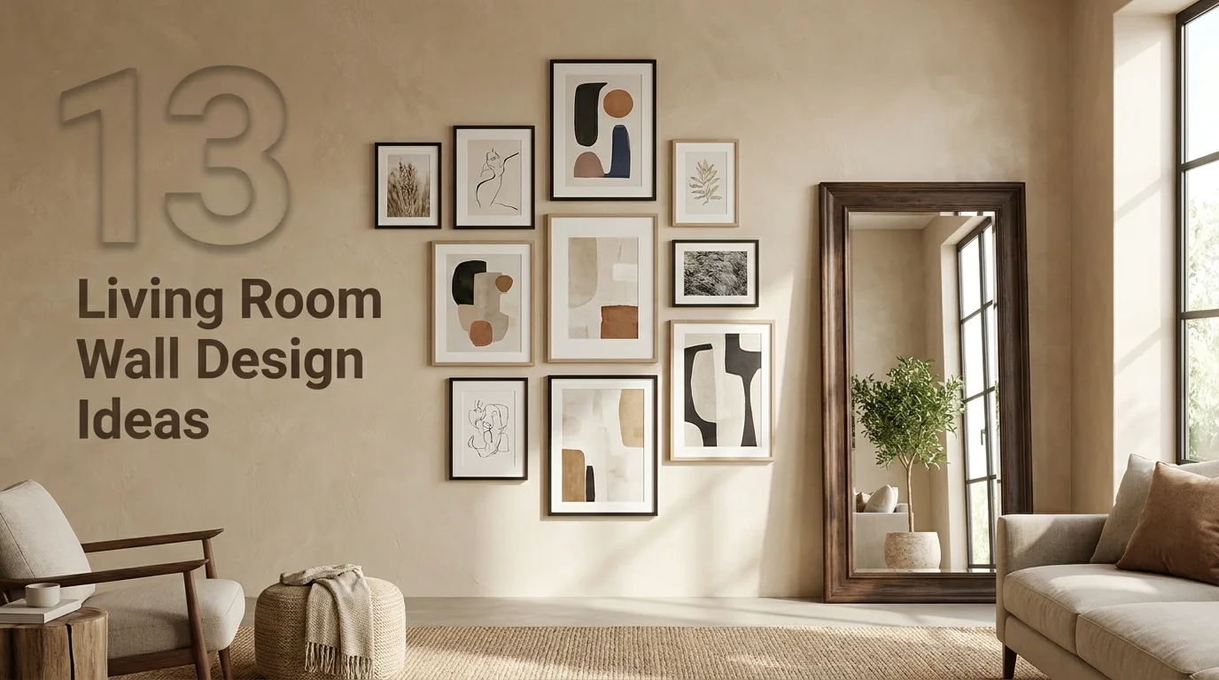
5. Group Art in Odd Numbers for a More Natural Composition
When arranging multiple pieces of art or objects on a wall, groupings of three or five tend to read as more visually balanced and intentional than groupings of two or four. This is a fairly well-established principle in visual design more broadly, not specific to living rooms, but it applies directly to how a gallery wall or object grouping actually gets perceived.
The practical application here is straightforward: if choosing between hanging four pieces or finding a fifth to round out the grouping, or between four pieces and paring down to three, either adjustment tends to improve the composition’s overall balance. This doesn’t mean even-numbered groupings never work, a matched pair flanking a mirror or window can look quite intentional specifically because the symmetry itself is the point, but for a more eclectic, gallery-style arrangement, odd numbers generally read better.

6. Use Picture Ledges Instead of Traditional Frames for Flexibility
A floating picture ledge, a slim shelf just deep enough to lean framed art or prints against the wall rather than hanging them directly, offers a level of ongoing flexibility that traditional wall-mounted frames don’t. Art can be swapped, layered, or rearranged without new nail holes every time the arrangement changes, which matters more than it might initially seem for anyone who likes to update their space periodically rather than committing to one permanent arrangement.
Ledges also allow for a layered look, a larger piece leaning at the back with a smaller piece or two propped in front of it, that reads as more collected and personal than a single flat-hung piece. This layering effect is difficult to replicate with traditional hanging hardware and is one of the more distinctive looks available through this specific approach.

A basic wood picture ledge runs $20 to $50 depending on length, and installation typically just requires standard wall anchors rated for the combined weight of whatever art will be displayed, making this one of the more accessible ideas on this list from both a cost and skill perspective.
7. Add Architectural Interest With Trim or Molding
A plain, unadorned wall can be elevated significantly through the addition of trim detail, a picture rail, a chair rail, or a more elaborate grid of applied molding creating a paneled effect. This treatment works particularly well in living rooms with genuinely blank, feature-less walls, adding a sense of architectural intention that the room may have been missing since it was originally built.
Applied molding in a grid pattern, sometimes called picture frame molding, has become a particularly popular treatment specifically because it photographs well and reads as considerably more custom and high-end than its actual cost and installation difficulty suggest. A modest room’s worth of this treatment typically runs $3 to $6 per linear foot in materials for a DIY installation, considerably less than it would cost to achieve a similar effect through more structural means.
This treatment pairs especially well with a single, unified paint color across both the molding and the wall behind it, rather than painting the molding a contrasting trim white, which keeps the overall look feeling more current and less like a traditional formal room from an earlier design era.

8. Choose Curtains That Extend Beyond the Window Frame
Window treatments function as a significant part of a wall’s overall visual composition in a living room, not just a functional element for controlling light. Mounting curtain rods several inches beyond each side of the window frame, and several inches above it, allows the curtains themselves to frame a larger apparent window opening, which has a real effect on how the entire wall reads, not just the window itself.
This is worth considering as part of the broader wall design decision rather than a separate, purely functional choice made afterward. A wall with a window dressed this way tends to feel more finished and considered as a complete composition than the same wall with curtains mounted tightly to the frame’s actual dimensions, even when every other element of the wall’s design is identical between the two scenarios.

9. Use a Large Mirror to Add Depth Without Adding Objects
A substantial mirror, whether leaning against a wall or properly mounted, does something no framed art or decorative object can: it reflects the room itself, effectively doubling the perceived depth of whatever it faces. This is a genuinely different tool from everything else on this list, since it’s adding apparent space rather than adding visual content in the traditional sense.
Positioning matters considerably here. A mirror that reflects a window brings additional light into the room and doubles the sense of the window’s presence, while a mirror reflecting a blank wall or an unremarkable corner wastes much of this potential benefit. Before committing to a specific placement, it’s worth standing in the room and actually checking what the mirror will reflect from the main seating positions, rather than assuming any wall works equally well.
A substantial floor or wall mirror in this category typically runs $150 to $500 depending on size and frame style, a meaningful investment but one that does genuine double duty as both a functional wall design element and a real space-enhancing tool.

10. Layer Wallpaper on Just One Wall Rather Than the Full Room
Wallpapering an entire living room is a significant commitment, both financially and in terms of how quickly the look might feel dated, but wallpapering a single accent wall offers much of the visual impact at a fraction of the risk and cost. This is one of the more direct ways to introduce genuine pattern and personality into a living room without it overwhelming the entire space.
A bold botanical print, a subtle grasscloth texture, or a graphic geometric pattern all read very differently depending on the wall they’re applied to and the room’s overall style, so this is worth pairing thoughtfully with the focal wall decision from earlier on this list rather than treated as a separate, unrelated choice. Quality wallpaper for a single wall typically runs $150 to $400 in materials for an average-sized living room wall, with installation costing roughly the same again if hired out rather than done as a DIY project.
Peel-and-stick wallpaper has improved considerably in recent years and offers a genuinely lower-commitment way to test this idea, since it can be removed without the same wall preparation and repair that traditional pasted wallpaper requires if the look doesn’t end up working as well as hoped.

11. Balance a Large Piece of Furniture With Equal Visual Weight Above It
A large sofa or media console beneath a small, understated piece of art creates a visual imbalance that’s easy to overlook until it’s pointed out, but genuinely affects how proportional and considered the wall feels as a whole. The general guideline is that art or an arrangement above a substantial piece of furniture should span roughly two-thirds the width of that furniture piece, not significantly less.
This is one of the more common proportion mistakes in living room wall design, defaulting to whatever art happens to already be owned rather than considering whether its scale actually matches the furniture beneath it. A small piece of art that was perfectly appropriately sized for a narrow hallway or a small bedroom often reads as undersized and slightly awkward once relocated above a full-sized sofa, even though nothing about the art itself has changed.

12. Use Sconces to Add Wall-Level Lighting and Visual Interest
Wall-mounted sconces do two jobs simultaneously: they provide a genuinely useful secondary light source, layered lower than a central overhead fixture, and they function as a piece of wall design in their own right, adding fixture-level detail and shadow play that a flat, unlit wall doesn’t offer. This dual function makes sconces one of the more efficient additions on this entire list, addressing both lighting quality and wall design at once.
Placement flanking a focal point, a fireplace, a large piece of art, a media wall, tends to work particularly well, since the symmetry reinforces the sense that the focal point was planned rather than assembled. Hardwired sconces require an electrician if there’s no existing wiring in that location, typically adding $150 to $300 to the project, while plug-in sconces with a visible cord offer a genuinely lower-commitment alternative that still provides much of the same visual and functional benefit.

13. Leave Genuine Negative Space Between Wall Elements
The instinct to fill every available inch of wall space with art, shelving, or decorative objects usually works against the goal of a considered, intentional-feeling room. Deliberate empty space between a gallery cluster and the ceiling, between a piece of furniture and the art above it, between one wall treatment and the next, gives the eye somewhere to rest and makes the elements that are present read as more significant rather than lost in visual competition with everything around them.
This is genuinely the hardest idea on this list to actually implement, since it requires resisting the urge to solve every decorating impulse within the same wall, sometimes deferring an idea to a different wall or simply choosing not to pursue it at all. But it’s also one of the highest-impact ideas here, since a wall with real breathing room built into its composition will almost always read as more sophisticated and more deliberately designed than a wall where every available inch has been put to some use.
A living room’s walls are never really neutral. They’re either working actively for the room, adding depth, texture, and visual hierarchy, or they’re quietly working against it, flat and undifferentiated in a way that’s easy to feel but hard to name. Treating wall design as its own real decision, not an afterthought once the furniture’s arranged, is what separates a room that feels finished from one that just feels furnished.